While food undoubtedly remains the primary focus of a restaurant, it is often the details that make an establishment remarkable. The ambiance, lighting, seating, and color schemes are essential elements that shape a diner's experience. Colors impact our mood, perception, and decision-making abilities, so choosing the right colors for your restaurant can be transformative. In this extensive blog, we'll discover the importance of color schemes in restaurants, their psychological effects, and their critical role in setting the right mood.
Why Is Color Important In Restaurants?
The strategic use of colors in a restaurant can elicit desired emotional responses in your customers, create a sense of brand identity, and influence potential clientele to come to your establishment. From stimulating appetites for a memorable dining experience to setting the foundation for your brand, the colors you choose have a broad impact.
- Create an atmosphere that represents your cuisine and restaurant genre: The right color scheme reflects your restaurant's cuisine and style. For example, vibrant colors highlight a lively, casual setting, while muted tones enhance the sophistication of fine dining.
- Define your establishment's brand image: Colors play a significant role in defining your brand's personality. Warm hues communicate a friendly, welcoming vibe, whereas cooler tones imply a more luxurious, high-end image.
- Encourage desired customer behavior: Colors can also subtly guide customer behavior. For instance, bright, stimulating colors like red can encourage quick decisions and turnover, perfect for fast-food establishments.
- Set yourself apart from competitors: A unique color scheme helps differentiate your restaurant. By selecting distinctive or unconventional color combinations, your establishment can stand out, creating a lasting impression that attracts new patrons and encourages returning customers.
How Do Color Schemes Affect The Overall Atmosphere Of A Restaurant?
Color schemes play a critical role in determining the restaurant's character and the dining experience it offers. Since colors have psychological associations, customers can relate to them subconsciously, making the hues you select of significant importance.
Appetite Stimulants
- Red: Known to stimulate appetites by increasing heart rate and appetite, this color is prevalent in many food advertisements, logos, and fast-food chains.
- Orange: Another warm color that promotes appetite, orange incites excitement and enthusiasm in diners, which can be useful in promoting specials or signature dishes.
Appetite Suppressants
- Blue: An appetite suppressant, this color instigates serenity, tranquility, and a sense of calm. Ideal for cafes or teahouses striving to offer a peaceful experience.
- Gray: While it can be sophisticated in certain contexts, gray is likely to dampen appetites and moods in a food setting, making it a less desirable choice for restaurant walls.
Health And Freshness
- Green: Associated with nature, health, and vitality, this color is perfect for vegan, organic, or farm-to-table restaurants that aim to emphasize health and freshness.
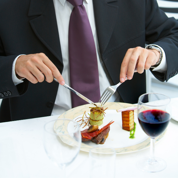
How Do Cutlery Color Choices Affect the Mood?
An often-overlooked aspect of restaurant design is the color of the cutlery. The shades and hues of cutlery can significantly complement the overall color scheme and make a subtle yet impactful difference in the dining experience:
- Enhancing Presentation: Colored cutlery can bring a meal to life by enhancing its visual appeal. It can create a striking contrast or harmony with the served food, transforming a simple plate into an art piece.
- Portraying Luxury: Gold or black tableware can embody a sense of luxury and sophistication, enhancing the overall posh dining experience.
- Setting the Mood: While shiny, bright silver cutlery might mirror a formal setting, colored variants like blue or green cutlery could create a fun, relaxed atmosphere.
Considerable thought into cutlery color could drastically elevate the dining experience, making it as desirable and memorable as the food.
What Colors Attract People To Restaurants?
To attract a steady stream of clientele to your restaurant, select colors that create an inviting, comfortable atmosphere. Warm palettes are often associated with energy and enthusiasm, while cooler palettes exude tranquility and sophistication. Neutral tones balance the atmosphere and maintain a cohesive and appealing visual environment. It's important to consider your target audience and the type of dining experience you want to offer to make the best color selection.
Restaurant Color Schemes And Combinations
When embarking on your restaurant venture, it is prudent to contemplate your establishment's color scheme. Developing a cohesive color palette that invokes the emotions and ambiance you desire is crucial in creating your brand's visual identity. Incorporate color combinations that complement your restaurant's genre and food offerings.
Fast-Food Or Quick-Service Restaurants
Fast-food or quick-service restaurants appeal to a broad demographic, from youngsters to working adults, and aim to provide a rapid dining experience. Typically, such establishments use bright, bold colors like red and yellow in their interior design and branding.
Red is an immensely powerful color in the field of food. It stimulates the senses, increases the heart rate, raises blood pressure, and prompts urgency, making it ideal for businesses that aim for quick customer turnover. Meanwhile, yellow, often associated with happiness and friendliness, makes a sunny and positive impression that complements red perfectly. When used together, red and yellow induce a lively, energetic atmosphere coupled with a sense of urgency, which is precisely what quick-service restaurants aim to achieve.
Fine Dining Establishments
Fine dining signifies more than superb food; it's about creating a superior dining experience that embodies elegance, sophistication, and tranquility. These venues often opt for muted, warm colors like burgundy or cream.
Burgundy, a deep shade of red, suggests a sense of luxurious sophistication and lavish living, bringing depth and richness to the dining experience. It exudes warmth and comfort, creating an intimate atmosphere encouraging diners to indulge and unwind. Cream, on the other hand, is a neutral that brings light, space, and elegance. When complemented with burgundy, the cream color instates a soft balancing note, offering relief from the intensity of burgundy while maintaining a warm, sophisticated atmosphere. Together, burgundy and cream create an environment as refined and distinguished as the food served.
Health-Focused Eateries
Health-focused eating establishments, like vegan restaurants, organic cafes, and farm-to-table businesses, strive to project a sense of freshness, vitality, and well-being. As such, shades of green and natural color palettes are the go-to choices for these venues.
Green is irrefutably associated with nature, vitality, and health. Its various shades, from avocado to olive green, symbolize freshness and organic origins, which health-focused food establishments aim to deliver. To enhance this effect, many health-centered restaurants use natural palettes that mirror the environment. Combining shades of green with hues of brown, beige, and other earth tones ingrains the establishment with a sense of purity, simplicity, and freshness, mirroring the philosophy of clean, health-centric dining.
Restaurant Interior Color Schemes To Set the Right Mood
The right color combinations on the walls, furniture, and decorative elements of your restaurant set the tone for the dining experience, shaping customers' overall impression of your establishment.
Creating a Cozy Atmosphere
Creating a cozy atmosphere appeals to diners looking for an intimate, relaxed dining experience. This ambiance is characteristic of bistros, coffee houses, and elegant fine-dining restaurants. The color scheme plays a vital role in establishing this mood. Consider pairing deep, warm colors like burgundy or brown with softer hues like beige and cream to foster a sense of warmth and intimacy.
The color combination not only creates a visually pleasing palette but also encourages a relaxed mealtime. This pairing implies a calm, slow-paced environment where diners can unwind, savor their food, and enjoy their conversation, making your restaurant the perfect escape from bustling city life.
Encouraging A Vibrant Experience
Restaurants aiming to provide a spirited, lively experience often resort to more enthusiastic color schemes. Fast-food restaurants, casual dining, or establishments targeting younger demographics find vibrant colors beneficial. It creates an atmosphere ripe with energy and excitement that's hard to resist.
Bright, energetic colors, such as red or orange, can stimulate appetite and conversation and heighten the senses. Red evokes passion and excitement, while orange radiates warmth and comfort. These powerful hues, however, need to be balanced to avoid sensory overload. Coupling these bold colors with neutrals such as white, beige, or light gray helps create a vibrant yet balanced atmosphere.
This vibrant color scheme keeps the mood buoyant and convivial, acting as a platform for animated conversations and hearty meals, mirroring the energy and zest of the eating-out culture.
Crafting A Serene, Relaxing Space
Creating a serene and relaxing space requires colors that encourage peace and relaxation, perfect for cafes, teahouses, or health-oriented restaurants offering a tranquil dining experience.
Choosing soothing colors like blue or pastel green sets the mood instantly. Blue is associated with the sky and water, symbolizing peace and tranquillity, and pastel green denotes nature and freshness, evoking feelings of restfulness. However, these calming colors could risk feeling cold and impersonal if used in excess. To mitigate this, pairing these tones with softer neutral accents like white or beige creates balance and adds warmth to the space without disturbing its tranquillity.
Drawing from the tranquillity of nature, this color scheme provides a restful and relaxing atmosphere. This soothing environment augments mindful eating, where patrons can slow down, savor their meals, and truly unwind, making your establishment a tranquil haven amidst the urban rush.
Choosing the right colors for your dining establishment is integral to creating an atmosphere that resonates with your customer base and enhances their dining experience. By understanding the psychological aspects of color, restaurant owners can create a space that not only pleases the eye but also stimulates appetites and encourages specific customer emotions and behaviors.
Picking Restaurant Colors For A Great Customer Experience
Finally, The art of choosing the right color scheme for your restaurant extends beyond simple aesthetics. It involves understanding the psychological effects of color, creating an atmosphere that delights customers, and aligning the color palette with your brand's essence. Thoroughly considering the hues on the walls, furnishings, and decorative elements can significantly impact the success of your establishment. Take the time to explore different color combinations, and let your restaurant's color scheme create a lasting impression on customers because they deserve so much more than just a meal.